iNoRisk Organigramme app for iPhone and iPad
Developer: iNoRisk
First release : 27 Jul 2019
App size: 2.65 Mb
Organization charts
pragmatic, logical, innovative
Actually, I wanted to visualize our group of companies only visually on the fly - maybe also an overview of our team structure, thats it. Then the search started. Which program is simple, clear and inexpensive. I found a lot, I did not like anything and that was too expensive and oversized. Ergo; we do something own.
The result in iNoRisk.org is now a detachment of the module "Organization charts" from the iNoRisk 4.0 App for Documentation in Occupational Health and Safety for the OSH organization. We found the functionality so beautiful that we decided to deploy it out of the way.
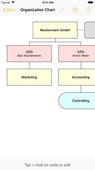
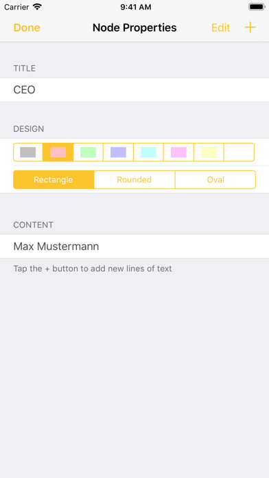
With a few clicks, you can build a structure and an organization tree and edit the fields by tapping. The "+" character adds new organization charts in the left column or additional text in the edit box. In addition, shapes and colors as well as the sizes can be adjusted. Thats it.
Anyway, we hope you enjoy the clicks and the easiest way to create an organizational chart that we can imagine. Its just easier - to let it be done ;-)

